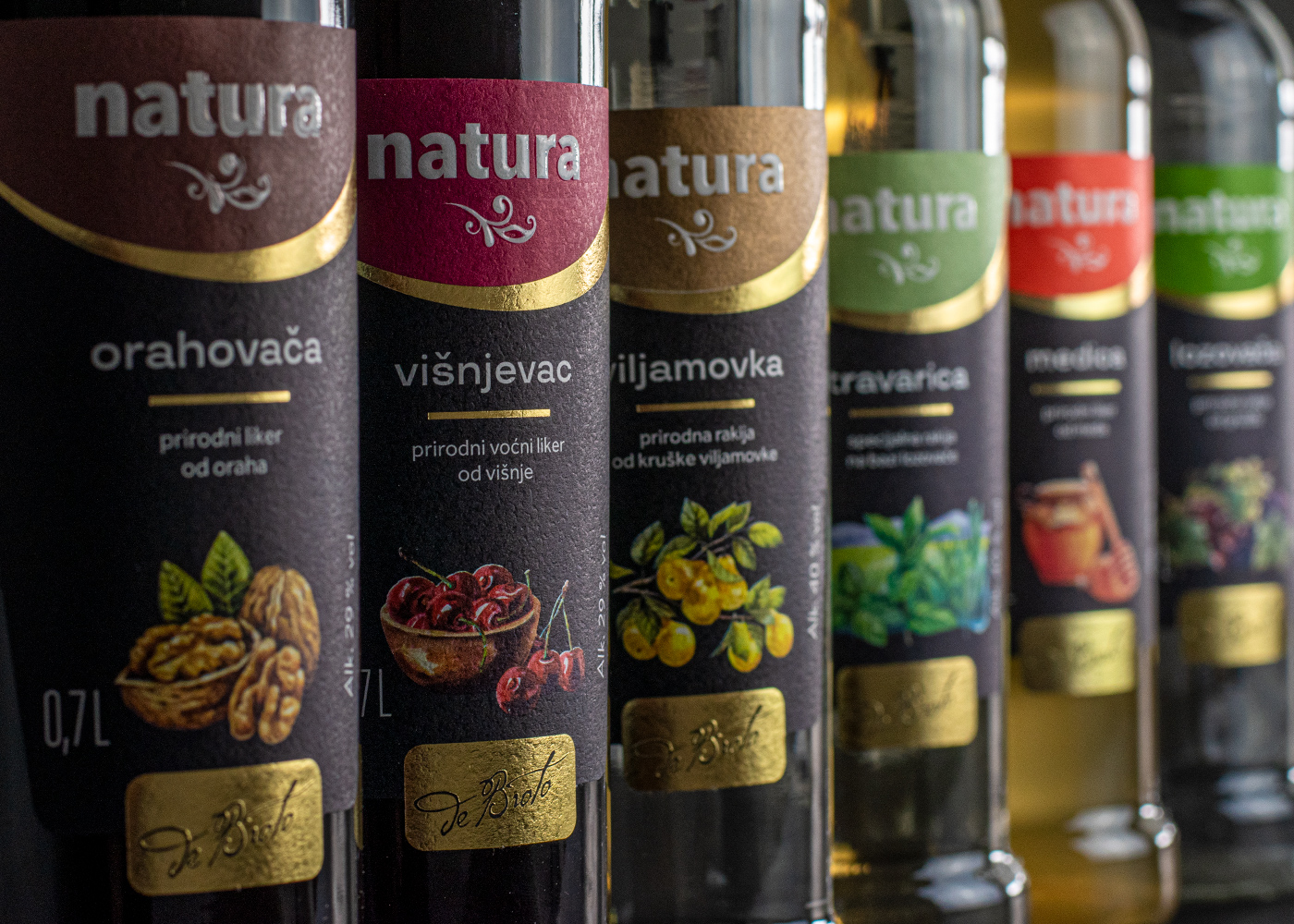
The food and beverage industry is one of the fastest growing and most competitive markets, with continuously increasing introduction of new beverage brands to the marketplace. As visual innovations play an ever important role in the industry, our client Hercegovinavino, a manufacturer of alcoholic and non-alcoholic beverages, decided to reinvent and modernize the visual appeal of their product line Natura spirits. Shift developed new visuals for Natura product line, that are modern yet respectful to the brand’s tradition. Our designers focused on primarily on our client's processes and manufacturing philosophy, drawing inspiration from nature and appealing colours. The newly structured visual language of the Natura product line is based on a combination of selected colours, simple typography and carefully deployed photography to appropriately represent each product. We decide to change the logotype colour for each product, for better differentiation, but all colours work perfectly together as well as on their own to create an attractive product line. Our goal was to create an appealing visuals and packaging, that would make it difficult for consumers to overlook this product on the shelf.
Visual Identity and Packaging Redesign for a Collection of Spirits
The food and beverage industry is one of the fastest growing and most competitive markets, with continuously increasing introduction of new beverage brands to the marketplace. As visual innovations play an ever important role in the industry, our client Hercegovinavino, a manufacturer of alcoholic and non-alcoholic beverages, decided to reinvent and modernize the visual appeal of their product line Natura spirits. Shift developed new visuals for Natura product line, that are modern yet respectful to the brand’s tradition. Our designers focused on primarily on our client's processes and manufacturing philosophy, drawing inspiration from nature and appealing colours. The newly structured visual language of the Natura product line is based on a combination of selected colours, simple typography and carefully deployed photography to appropriately represent each product. We decide to change the logotype colour for each product, for better differentiation, but all colours work perfectly together as well as on their own to create an attractive product line. Our goal was to create an appealing visuals and packaging, that would make it difficult for consumers to overlook this product on the shelf.


