Livano cheese was named after Livno field area located in Bosnias southwest, from which it originatedand and from where its production spread to the areas of Glamoč and Tomislavgrad. This fact confirmes its relevance trough the persistent habit of consuming this cheese and expressed interest and possibility of its export. During the 126 years old (1886th-2012th) production tradicion the original recipe has undergone some local modifications which gave it much more specificity. Today Livanjski sir is recognized by full and pleasant taste with a reputation for excellence.
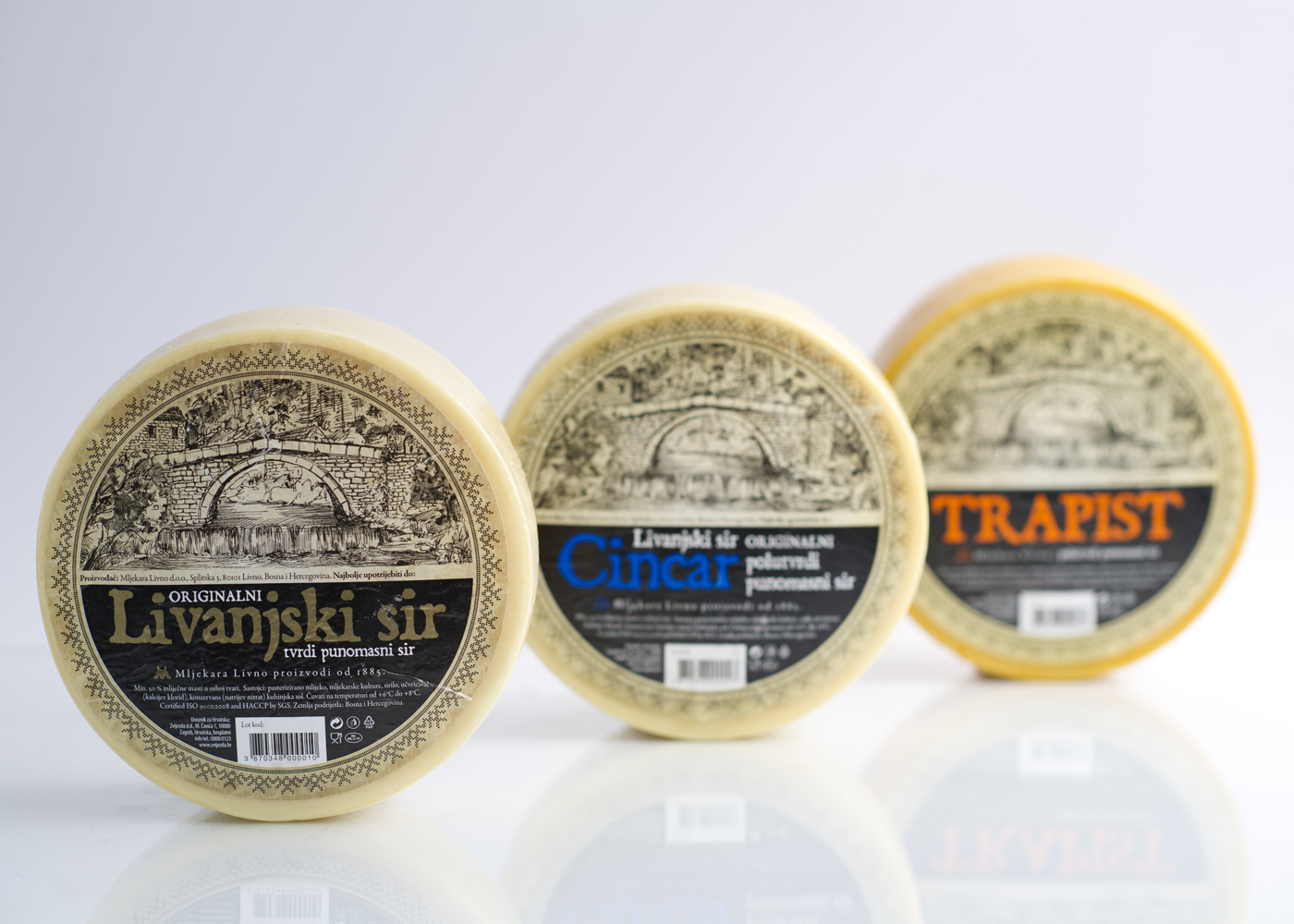
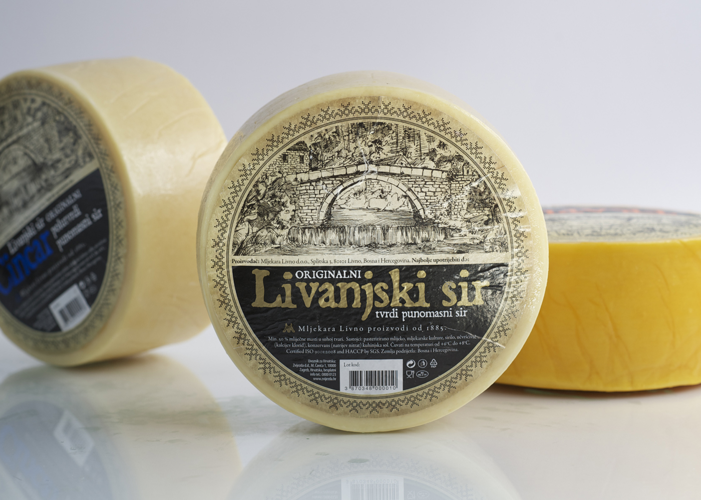
Our challenge was the request of our client that the new label needs to reflect the original label, yet the new brand identity has to be an urban and chic one, that would target sophisticatet gourmets around the world. Since the beginning of the production of the cheese, the old bridge at the source Duman of the river Bistrica has been the core identity element. The bridge is also a national monument of Bosnia and Herzegovina. The old bridge as a symbol of tradition is illustarated in a classic style - like old Livno postcards from the end of 19th century – to capture the nostalgia of a time when the dairy of Livno started producing this great cheese.
We created a pattern based on traditional piecing techniques that characterize the folk art of the Livno region, precisely the traditional gown of the Livno region. Tradicional objects have become elements of the pattern that we used largely because we needed to express more the border between the label and the product. Our solution is a modern brand identity which connects the product`s authenticity to its top quality. The visual identity redesign includes two other well-known cheeses from Mljekara Livno - Cincar and Trapist. Different colour is used to give the three sorts of cheese differentiation. This kind of rebranding was primary a strategic decision made by Mljekara Livno. Consistency is one of the most powerful marketing tools. Shift brand design has showed that consistency in design does not need to be limiting or stiff – we rather treated our clients request as a challenge.