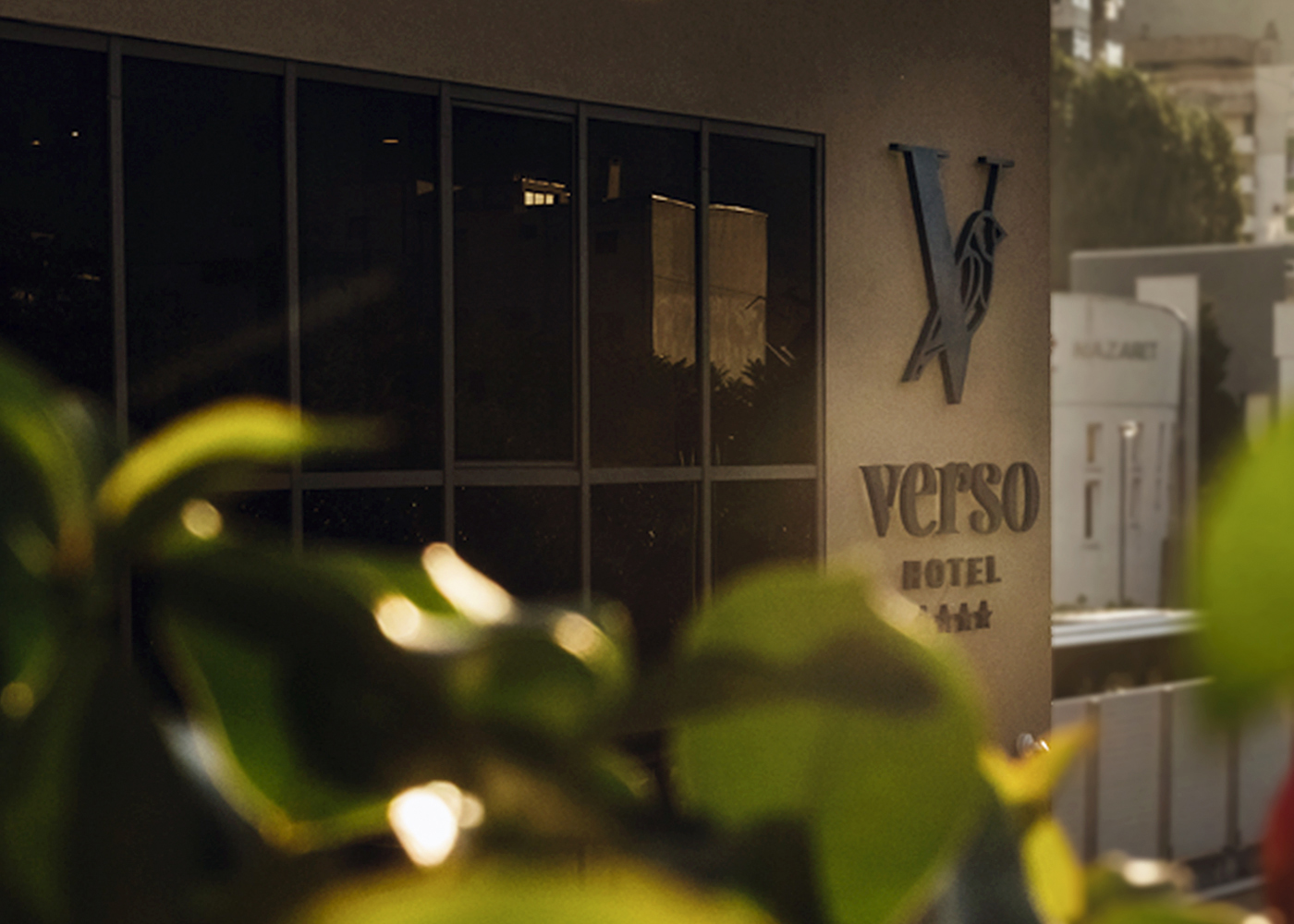
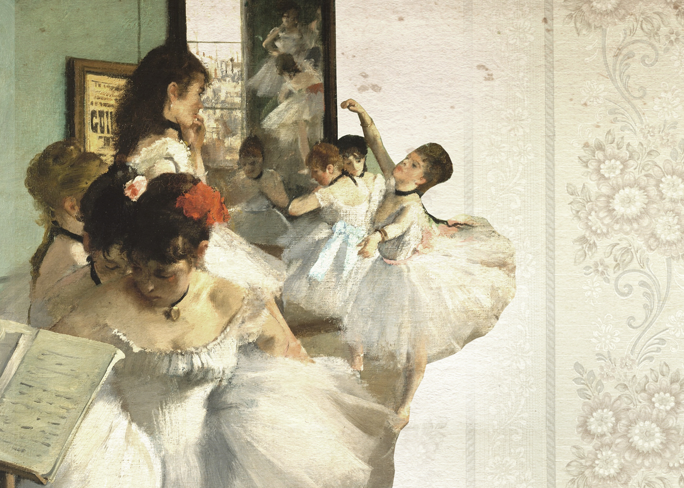
Shift created the verbal and visual identity for Hotel Verso, located in the city of Mostar. The project included development of verbal identity, visual identity design and brand guidelines. The brand identity had to reflect the energy and to capture the true spirit of Mostar, as there is a really special vibe in Mostar, especially in spring and summer months when the melodies of the Mostar siskin birds can be heard along the Radobolja River.
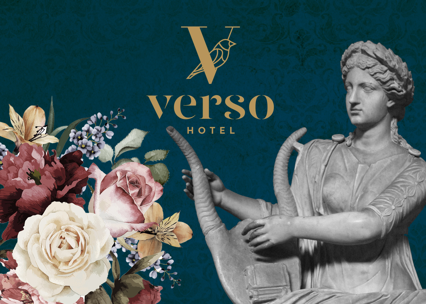
The identity also had to convey a modern, sophisticated, experiential journey for customers, and one that would connect with them on an emotional level and contribute to their experience of great accommodation. We have created an appealing and suggestive name that is also easily pronounceable and exportable to other countries, which is very important in tourism industry. Verso is an Italian word for verse. The name is a reference to the part of the city where the hotel is located, and where some of the Mostar famous artists lived in the past.
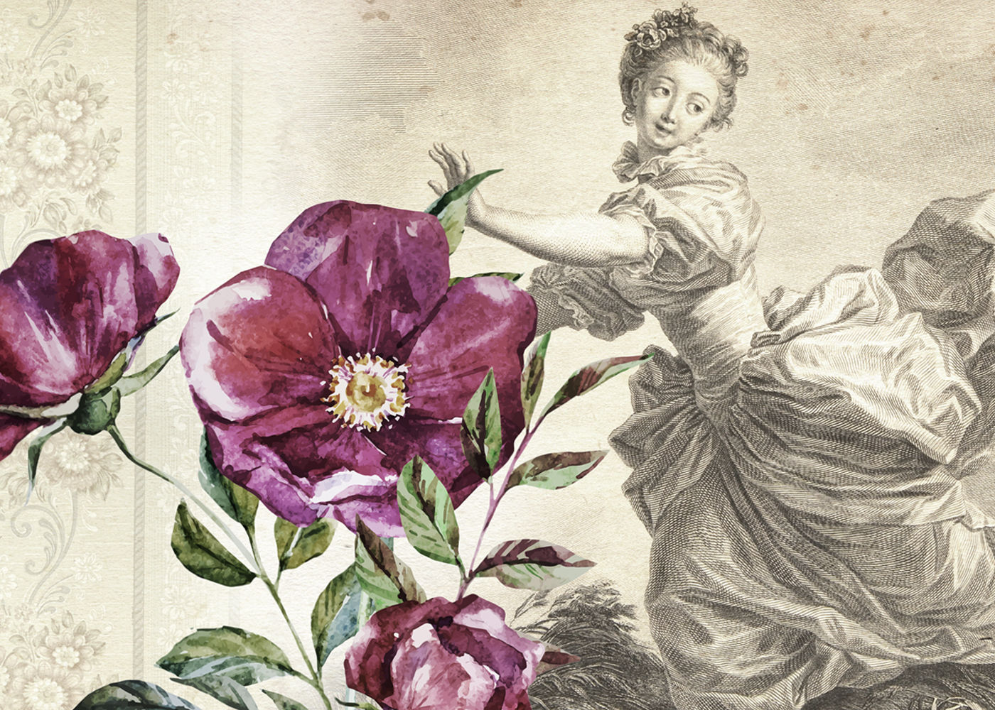
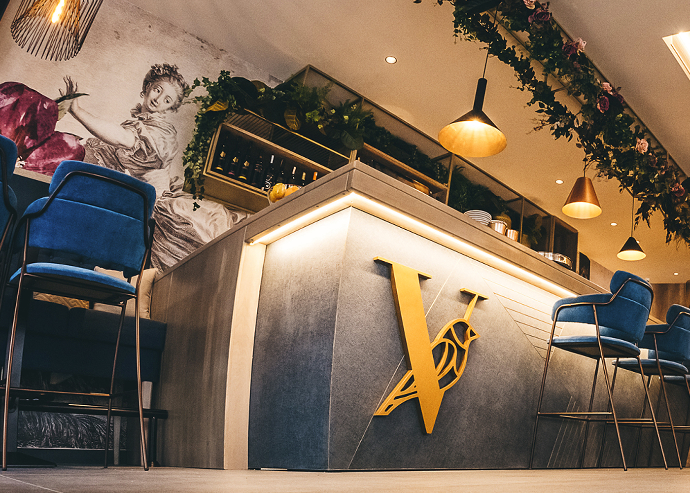

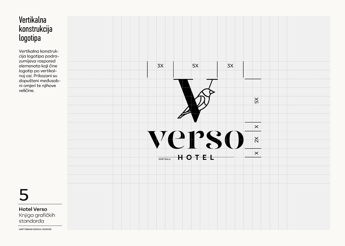
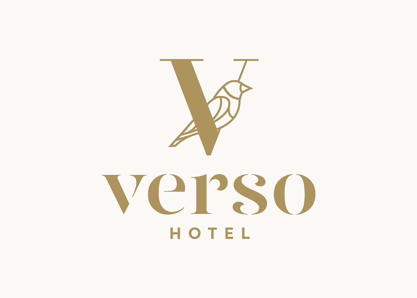
Whilst remaining as bohemian as the city it is located in, the cornerstones of the hotels brand identity are still simplicity and fluidity, to symbolise a modern tourism facility. For the new identity our designers created a symbol based on the letter "V" with a silhouette of a little bird standing on a tree trunk.


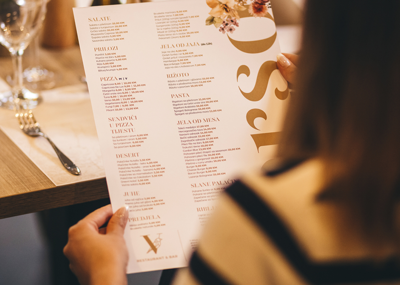
The selected colour of the letterform is blue and gold in order to express the elegance and modern style of the hotel. Shift created a brand book that defines the core brand elements, both verbal and visual into a cohesive story, along with the signage, stationery and interior graphics. This brand book provides the Hotel Verso team with the formula to preserve the power of their identity as they develop and grow.